Moving on.....
My three favorite films from class
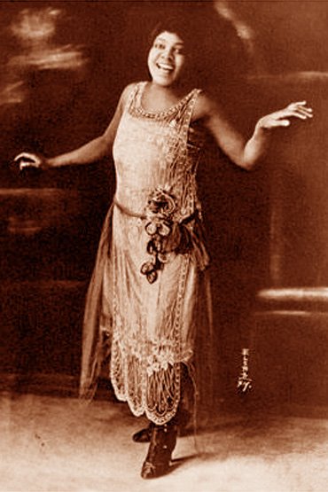
This film was one of my favorites due to the color palette. I remember being a child when seeing a big billboard of a woman's stomach and holding a red flower. I always thought it was one of those movies that exploit women's sexuality or something so I never thought much of it. Plus, I was not allowed to watch "adult films." Even when Titanic came out, I had to look away per my parent's request during the "draw me with only wearing this, only this" scene. Once I did watch American Beatuy in Netflix about when I was 20 or so, I though to myself, "this was it? What a "pervy" movie with so many sad people?" To me, it was very reminiscent of the Lolita novel. After taking this class, I got a COMPLETELY NEW perspective on films overall and made me appreciate the films and the dedication that is put into it. So when I think back to my 20 year old self, I think that it did have an impact on me because I felt that each character was raw and not a character that had everything going for them not there was a happy ending as I was accustomed to watching. Seeing this film allowed me to see that films are mirrors of daily interactions and most importantly that life has ups and downs and realizations.
So this is my realization, films are meant to inspire and provoke feelings that you never thought you wanted to feel. The ability to capture emotions on screen is so powerful.
I never capture the color red until now. There was so many red that I missed and so many messages. It was as almost he never could escape it even after death he was covered with it. It had a very powerful message to me. And the entire "Mr. Smiley." The irony is just genius!

Let us talk about film noir!

I am a sucker for this genre of film and this movie Double Indemnity. I adore the entire black and white film. The use of shadows make this film intense. I remember a quote I heard once in which discusses the reasons that movies make you feel scared of terrified and it is not because of the action of the film but the action off camera that really makes a statement. Examples can be found with Hitchcock where a murder takes place but there is not real action. It think shadows are as important as the real thing.
Pulp Fiction was one I had already watched and loved for the different story lines that come together. It was confusing to figure out the begging to end liner plot but the way it was edited made it enjoyable.

This dance scene is awesome!

I was still trying to figure out how exactly the films sequence was because the editing was great. I found this online a couple of weeks ago via designtaxi.com

I will print this out and watch it to see how it looks like linear, just for fun!
My Personal Favorites
One film that was not assigned but it was mentioned and described in the readings is the City of God by directors Fernando Meirelles and Katia Lund. In the book, there was a feature of the opening scene and the meaning of its representation to the main character. I think this is a GREAT film to watch as it shows many techniques that were discussed in class.

Low Angle Shot is used throughout the film to show dominance. This shots of the kid below are interesting because he ends up growing up to be the most feared gang leader in City of God.
One non traditional shot is featured below where the the couple is to the right of the screen and not centered.

Let's not forget the color wheel!
Color Wheel can be use as in the case of the image below.

These cool colors tend to show up throughout the film and remain consistent.
This color wheel can also be seen for the entire movie, as shown below. The picture below is of the entire movie City of God. It is every shot of the movie sliced to show the different colors like a bar code. You can see more of this beautiful imagery for more movies HERE.

again cool colors are shown throughout the film.
Another movie I like was directed by Dee Rees. This one is Pariah and was released at the Sundance Festival.

I remember seeing this film and being amazed by the colors even though it was a film that showed so much hardship. The film uses complimentary colors: Pink/purples and Yellow. There was always a shot that had a hint of yellow. Before taking this class I remember being intrigued as to the reason why a film would want to make such an obvious statement with COLORS but this film is a good exampled of the color palette.


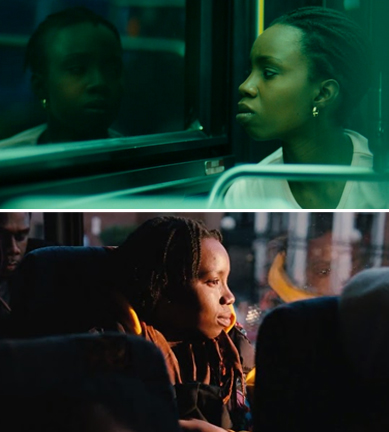
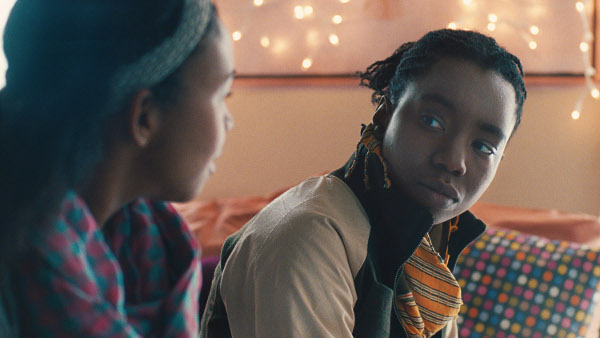
THIS IS THE COLOR PALETTE FOR THIS FILM.

Last but not least, the film brick by Ria Johnson.


This film won the Special Jury prize for Originality of Vision at Sundance.
The plot of the movie is centered around a group of high school kids who are mixed in a world of drugs. The main character's , Brendan, girlfriend is murdered and he goes on a mission to investigate who murdered her all while hiding her body. He deals with a a lot of thugs and drug dealers along the way and meets people who "help" him.
There are a lot of wide shots throughout the film.
The rule of thirds is shown below.


I love this movie for the over the shoulder shots.


Brick introduces a noir feel to the screen as well as the femme fatale Laura. Once she is told she is the reason why Brenda's girlfriend died, she immediately tells him that the baby was his and that she did not love him and simply walks away. This is reminiscent of the film noir.
Hope you enjoyed my movies which I think are great to be exposed to other film students. My only regret in this class is not being able to take a longer week course so learn more!
I know I converted to a film enthusiast and I can't wait to see many more film through my passage of life!